среда, 25 октября 2017 г.

Welcome

Hello!

You are free to use any information in the articles below and sharing it with the direct active hyperlinks (URLs) to blog page.

Have fun!


Warhammer photography


Hold the door. Nov. 2017

четверг, 19 октября 2017 г.

Culture and attention to deails

Billions TV series fragment

Русский дубляж:


Итог: Смысл ролика хорошо сводится к японской пословице:

Из-за незабитого гвоздя потеряли подкову,
Из-за потерянной подковы потеряли лошадь,
Из-за потерянной лошади гонец не доставил послание,
Из-за недоставленного послания проиграли войну

Result: The sense of scene points to famous proverb:
For want of a nail the shoe was lost.
For want of a shoe the horse was lost.
For want of a horse the rider was lost.
For want of a rider the message was lost.
For want of a message the battle was lost.
For want of a battle the kingdom was lost.
And all for the want of a horseshoe nail.

среда, 18 октября 2017 г.

Choice or Illusion of choice

Gatsby-Matrix

Pills are also not usual:
Justice vs soilerosion
The allegory of the long spoons In hell the people are unable to lift food to their mouths using such unwieldy cutlery, and are starving. In heaven, the diners feed one another across the table and are sated. The story can encourage people to be kind to each other. The story suggests that people have the opportunity to use what they are given (the long spoons in this allegory) to help nourish each other, but the problem, as Haim points out, lies in how the people treat each other. Given the same level playing field one group of people who treat each other well will create a pleasant environment. Whereas another group of people, given exactly the same tools to work with, can create unpleasant conditions simply by how they treat each other.

вторник, 17 октября 2017 г.

Document print protection

One of the client had a problem with lack of basic print protection with presaving copyright details. Several protection 'watermark' elements and their properties were designed and applied. Here is the demo image.


пятница, 12 мая 2017 г.

Design process of my personal logo

Finally I found a little time to write about my personal logo-trade mark which had been created ~ month ago.

I needed it as watermark for my works, for several social accounts and for business cards.

First, I've had an idea that the main graphic part should be similiar to Teseract graphic representation, as my degree and the main professional business activity was still a System analysis. A little more background for everyone: Any system is "Tesseract" and person can research and describe it only by making projections of this system.

Animation of tesseract (the four-dimensional analog of the cube)


There is also static image:

But first task for me was to simplify it and connect with my Cyrilic initials (УМИ) to personalize it.


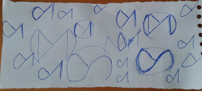
I made several sketches:


The simple version looked like Gmail icon even with changeble line types. The struggle was real:)
Then I took a pause and continued on the next day in the morning during breakfast right in the kitchen with papers for shopping-lists. I just left the initials inside the tesseract "form":

After several minutes of sketching with available means I saw one appearnce which I need.
Time to "digitize" using Illustrator:
Building from simple forms, slicing and connecting to each other:
Chosen with Sharp corners:

And maybe with gradient: